


Word has gotten round quite some time ago that the Pantone colour of the year 2019 is Living Coral. However, using this colour in your home isn’t always easy. So, here are 5 ways you can combine the Pantone colour of the year with other colours.

5 ways to use the Pantone colour of the year
Focal Point
For this colour combination you combine the Pantone Living Coral with the Pantone colours:
- Storm Gray
- Forest Biome
- Martini Olive
- Golden Lime
- Mauvewood
- Twill
- Beluga

When you combine these colours with Living Coral, it becomes the focal point in the palette. It creates a nice contrast against the darker colours and gives a cool tone to the room.
Shimmering Sunsets
To create a shimmering sunset you need the Pantone colours:
- Conch Shell
- Hot Pink
- Aurora Pink
- Magenta Haze
- Radiant Yellow
- Amberglow
- Papaya

Add in the Living Coral and you get a perfect sunset in your home. The palette is bold and evocative, it gives you a pleasurable warmth and it is the excellent combination to energize and spark up the room.
Sympatico
Are you looking for a pink vibe for your home, this Pantone palette with Living Coral is the one you need.

- Burnt Henna
- Rose Dawn
- Coral Sands
- Sun Kissed Coral
- Candlelight Peach
- Sand
- Mellow Buff
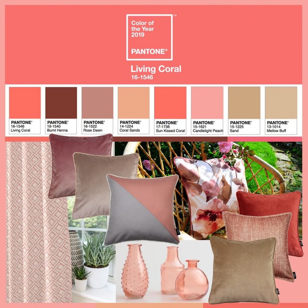
This combination of pinks portrays multiple skin tones and adds the softness and warmness to a home to create a healthy glow. This beautiful range of colors will give your home a livable feel.
Trippy
A bit more eclectic palette is the trippy colour combination.
- Sulphur Spring
- Chive Blossom
- Vivacious
- Barrier Reef
- Deep Lake
- Ibiza Blue
- Pink Lemonade

Together with Living Coral, this Pantone colour combination gives you a dizzying effect from all the hallucinogenic shades. It is an eclectic combination of joyful colours that gives you a feel of pure and unadulterated fun, it has that spontaneity you sometimes need in your life. So, adding it to your house will make you feel like a kid once more.
Under the sea
The last colour palette is aptly named under the sea just as the colours.
- Blue Depths
- Turkish Sea
- Viridian Green
- Turtle Green
- Sea Pink
- Vibrant Yellow
- Limpet Shell

Combine these with the Pantone colour Living Coral and you get the vibe of a watery environment, a beach area or even a tropical island or paradise. Once again Living Coral has become the center of attention in this palette, it is a naturally vivid colour that combines with the colours of the sea only stands out even more. It also symbolizes the coral and the diverse kaleidoscope of sea life it shelters.